Akamai Technologies
Akamai Control Center
Streamlining an enterprise web portal

Problem
Customers weren’t happy with the usability and performance of Akamai's web portal. The platform was built on an old tech stack and lacked cohesive design across its hundreds of pages. These problems had gotten worse over the years, as more features were added. This resulted in a slow, unintuitive, and outdated web portal — meanwhile, competitors with cleaner, more friendly interfaces were becoming a market threat.
Objective
Provide Akamai’s users with a refreshed, modern web portal that allowed them to focus on their work, stay informed about their services, and act quickly on their tasks.
Outcome
Akamai launched a new Control Center experience, streamlining and improving functionality while adopting its new in-house design system. The redesigned experience included a new home page, global header, menu, notifications, and search. The new home page was viewed as more functional and intuitive, and loaded in half the time of the old home page.
The redesign was rolled out to all users (over 110k, including international and partner rebranded audiences) in Q2 2019, after a successful opt-in beta (~50k users) throughout Q1 2019. It received positive user feedback, with 75% of users preferring it over the previous design, and ratings increased over the next weeks after launch.
Role
The project team consisted of UX design & research, product manager, program manager, software architect, front-end developers, and QA. We had 1 lead UX designer, 1 UX/visual designer (me), and 1 UX researcher.
As one of the UX designers, I was responsible for creating user flows, exploring and iterating on solutions, creating wireframes and interaction specs, finalizing visual design, and assisting user research and QA. My design focus was on the home page, while the other designer focused on the menu and notifications.
Process
We assembled a cross-functional team (UX, product, program, software architect, FEEs, QA) and kicked off the project with user research and design sprints to identify our user pain points and design goals. We iterated on the designs over multiple rounds, testing different functionality and layouts with both customers and internal users, before we landed on our final design. The new design was first launched in a beta phase, then rolled out to all 100k+ users.
Our design goals:
-
Make the menu system more intuitive and provide shortcuts to common tasks.
-
Keep users informed of their account’s status, changes, and activity.
-
Provide a modern and consistent look-and-feel across the platform.
Iteration
We iterated our designs over multiple rounds, testing different functionality and layouts with both customers and internal users, before landing on our final design.
Our first round of research helped us discover high-level issues with our current web portal and how users thought about their workflows.
-
Users typically log in with a specific task in mind, but navigation is clunky.
-
Some customers don’t fully understand what features or services they have, or might be lacking.
-
Customers have no single view to see how all their “stuff” on Akamai is doing.
With that knowledge, we created three initial goals for our redesign:
-
Make the menu system more intuitive and provide shortcuts to common tasks.
-
Provide insights into how users can make better use of Akamai services.
-
Show users their account’s status and activity.
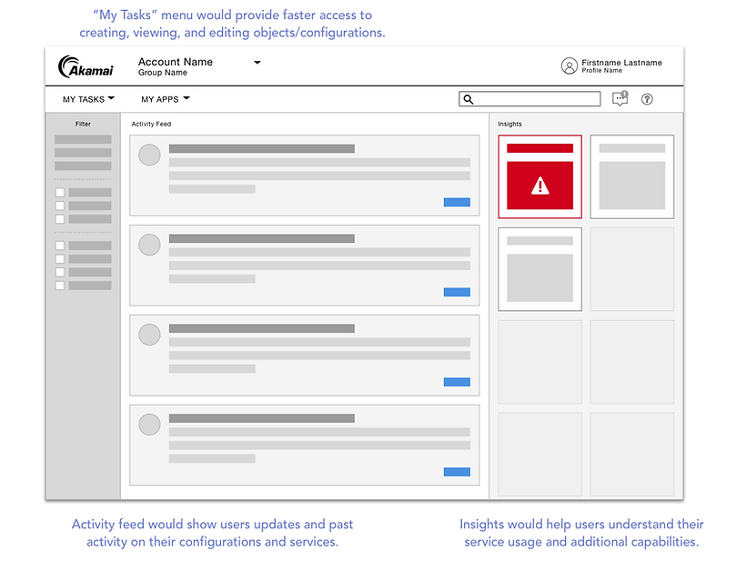
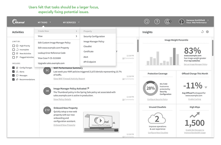

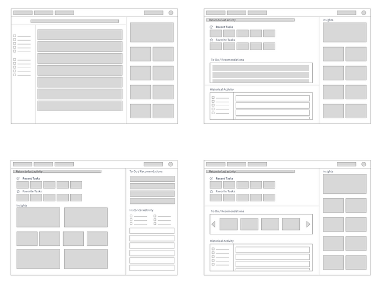
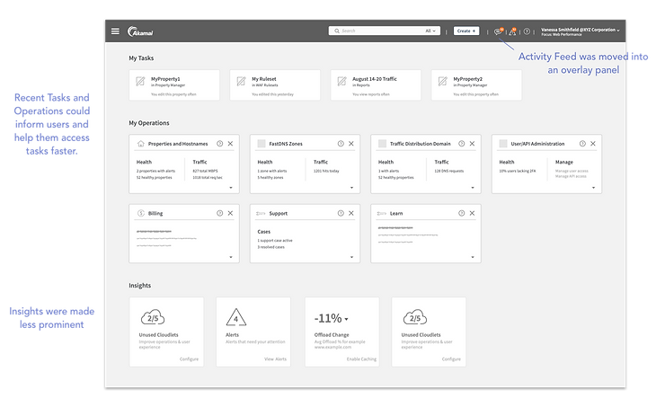
After receiving user feedback, we knew we had to pivot on the design direction. We brainstormed more layout options, and how to best present the functionality that users had commented positively on.
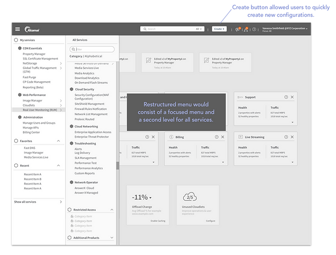

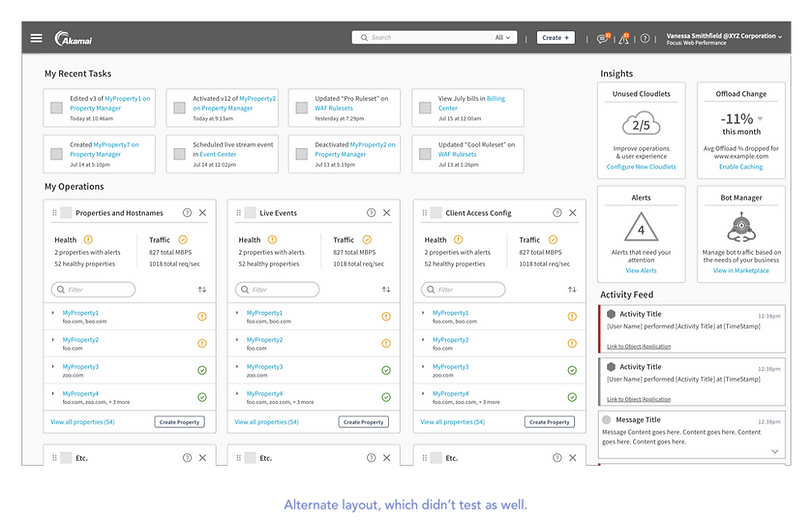
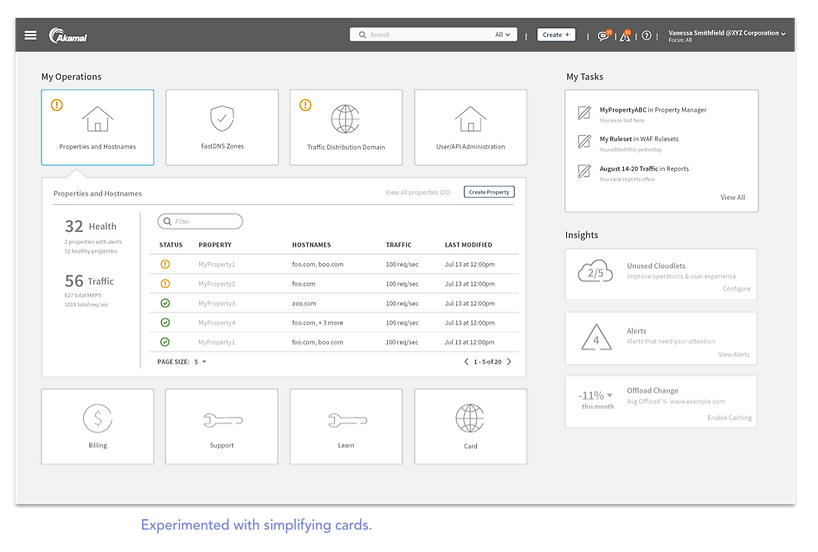
Final design
The modernized portal experience provided an on-boarding carousel and new home page functionality. Status cards provide visibility to the status of the user's services, alert them of any issues, and links to take action. "Your activity" links to applications and objects the user recently visited, allowing them to pick up quickly on where they left off.


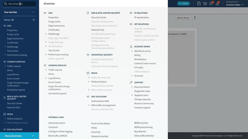
The new streamlined menu provides quicker access to key applications. It is organized by product category, and can be filtered by focus area or searched by an item's name or description. The full service catalog helps users discover new product offerings.


In production
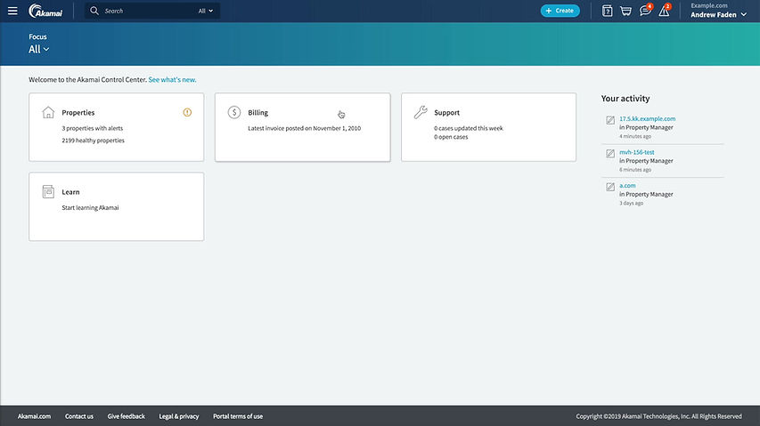
Notifications keep users informed about messages relevant to them. Account activity provides visibility to changes across the account.


